KING OF GAMES'S PROFILE
I'm a young fool and I make games via RM. I enjoy game mechanics and theories, especially new graphical experiments. I'm a master chip splicer and I draw my own resources as well. Teaching myself how to digitally paint via PS, after pixeling for several years.

Search
Filter
 pixel movement and terrain collission on rpg maker 2003
Well you're always gonna have that problem because of how RM handles priority. Anything above the hero needs to be a higher number picture. I'd suggest making the NPCs charasets like how Kazesui did in his example demo. The whole point of the system is that the pictures can still interact with events.
 pixel movement and terrain collission on rpg maker 2003
 Game Graveyard
 Game Graveyard
I think its function would work better as a sort of museum of dead projects, to admire. Tampering with other people's things doesn't seem right. Let it die, respect it, learn from it, let it inspire you.
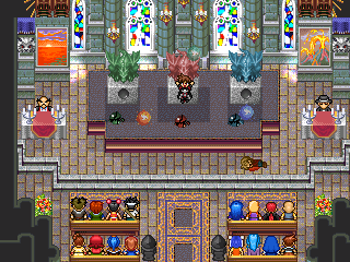
 Chandelier?(2k/3)
 The Screenshot Topic Returns
Tao, the sprites work with theo, it creates a good contrast. The only thing I would change is the first screen, the depth of the bottom floor is hurt by those light tiles. If you leave the bottom floor all dark, and the top floor all light, then it will really push the perspective/depth.
 Requests for Deckiller to review your game
Can you do one for Monstrous Wars? It only has one review, which is for an older version. The more feedback I get, the more I can gauge what works and what doesn't.
 Barkley 2 Kickstarter
 The Screenshot Topic Returns
The question should not be dither or not dither, because the shading should adhere to the form of and volume of the subject. Right now there's a fundamental problem with your shading which is making it look flat.
Your lines have jaggies and are inconsistent in width. And that pillow shading got to go. Some more dynamic colors with shading adhering to the planes of the face will push it farther than any stylistic arbitrary dither.
Here's an edit I threw together highlighting cleanup:

It looks kind of freaky but that's because of the odd anatomy of this doll style that you are going for.
Your lines have jaggies and are inconsistent in width. And that pillow shading got to go. Some more dynamic colors with shading adhering to the planes of the face will push it farther than any stylistic arbitrary dither.
Here's an edit I threw together highlighting cleanup:

It looks kind of freaky but that's because of the odd anatomy of this doll style that you are going for.
 The Screenshot Topic Returns
The sprites are getting lost under the details of the roof. The black outline helps a little, but you're going to have to introduce some more contrast to them to make them a focal point. Maybe also experiment with different shading approaches to the roof. Something more planar could imply the detail that you are looking for, while leaving space for the sprites to read better.
As has been mentioned before, the portraits should not be dithered like that. It makes them look like furry rocks. The portrait pallet has a lot of colors that are too similar, or not enough hue shifting, which gives it an overall flat appearance.
The white building draws too much attention because it is white. Maybe make it
grey? It's just a background piece.
I like the overall style and mood of the piece, but you can push it further!


